![Bitcoin BTC On-Chain Analysis [1 April 2024]](/content/images/size/w600/2024/02/Bitcoin.gif)
Table of contents
Introduction
Bitcoin is taking a breather from the uptrend and the last week the price was consolidating in the narrow range.
However, today we see an increased bearish pressure coming from the weekly, monthly and quarterly transition.
And, the current on-chain analysis has to be looked at along with the Bitcoin technical analysis released earlier today.

From macro perspective, the overall price action in this cycle is very similar to prior All Time High (ATH) break-outs.
Various on-chain metrics exhibited a strong profit taking in the last few weeks, however a historically high liquidity in the market and the buying power in exchanges points to a continuation and, possibly, acceleration of the bullish trend.
In the post, we will have a look at the blockchain data of Glassnode and, using on-chain data, will confirm why it is very likely that Bitcoin price will continue to move up from its current price or after a bearish pull-back is finalized.
Bitcoin Price Performance
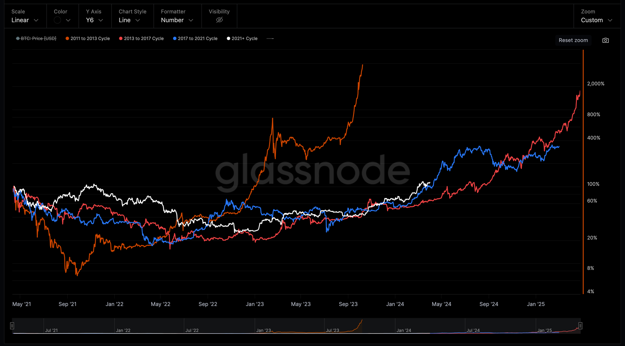
Indexing the price performance (white) since the April 2021 ATH, we can see a remarkable similarity with the bull market in 2020-2021 (blue) comparing the duration and distance from the April 2021 peak.
Market Liquidity
Bitcoin Net Flow Volume in Exchanges
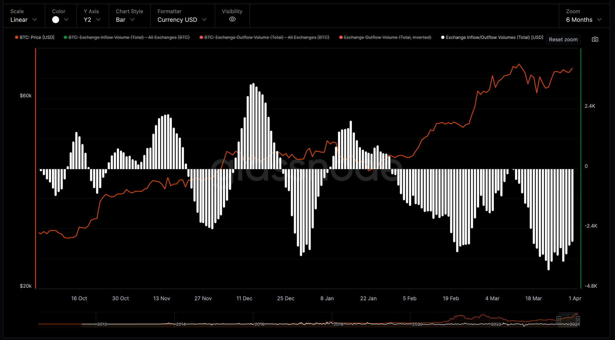
We continue to observe a steady outflow of the BTC denominated volumes from all exchanges resulting in the negative netflow volume (white histogram based on 7-Day Moving Average).
The continuing withdrawals indicate a shift toward personal custody, which could be interpreted as a bullish signal.
Stablecoins Exchange Buying Power Net Position Change
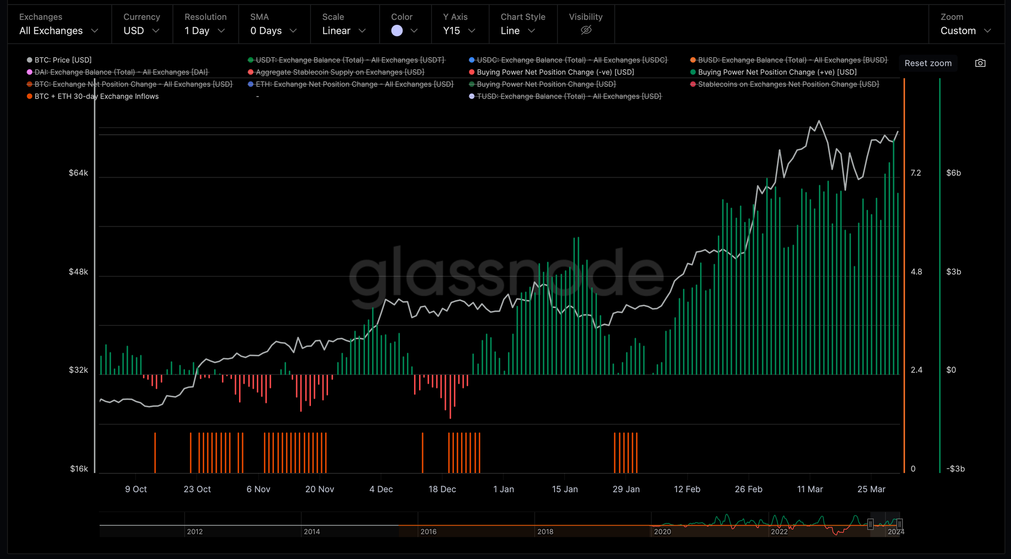
Stablecoins stored on exchanges are used to acquire crypto assets.
An increase in stablecoins sent to exchanges represents an increase in buying power, as well as overall bullish sentiment, since the buyers are looking to exchange their stablecoins for Bitcoin and Altcoins.
After 15% correction from the new ATH at $73,100 set on March 13 to $1,800 printed on March 20, we continue to see an increasing USD volume of stablecoins (green histogram) which are flowing into exchanges relative to BTC and ETH over the last 30-days.
This is highly positive not only for Bitcoin, but also for the rest of the Cryptocurrency market.
Aggregate Market Realized Value Net Position Change
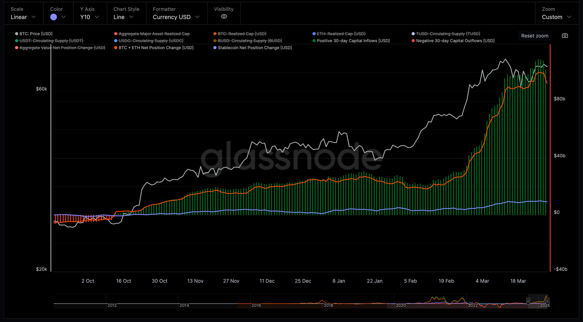
The above chart shows the aggregate 30-day Net Position Change of the largest and most dominant assets.
Net capital inflows can occur either via uplifts in the Realized Cap for the major assets BTC, ETH and LTC, or via growth in stablecoin supplies considering USDT, USDC and BUSD.
The crypto market is witnessing a massive influx of funds as investors and traders rush to buy cryptocurrencies amid a bullish rally.
Last week when Bitcoin price was recovering from the correction we saw a steady 30-day capital inflow above 100 billion dollars per day which is the record high values.
Bitcoin: Long-Term Holder MVRV
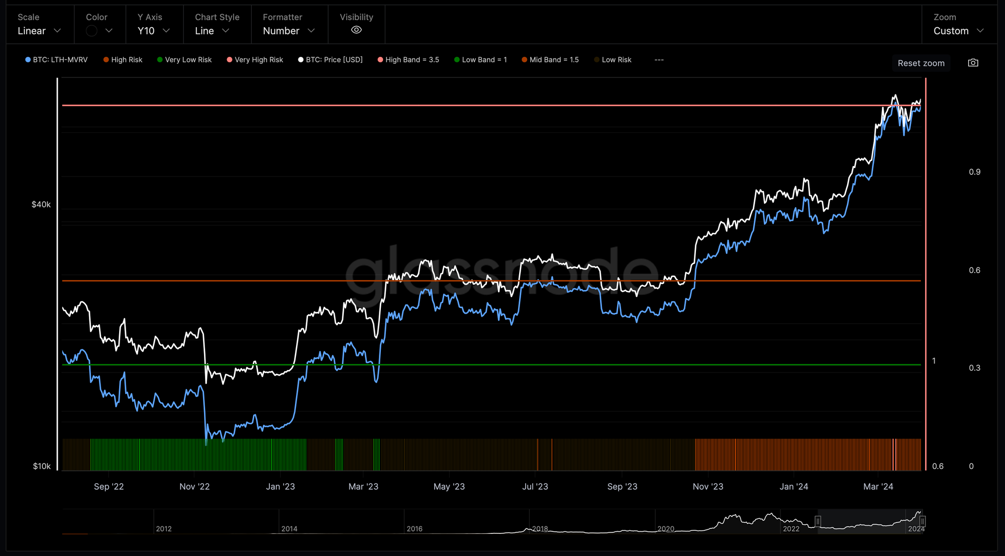
Market Value to Realized Value (MVRV) ratio is a way to identify whether Bitcoin price may be under or overvalued at any moment in time and can be used to help evaluate the tops and bottoms of the Bitcoin.
Currently, MVRV ratio sits just below 3.5.
That means, in aggregate, hodlers are up 3.47x on unrealized profits.
The MVRV at 3.47 is historically the zone from which parabolic price moves begin to develop for Bitcoin, as Euphoria kicks in.
In other words, at a ~3.47 MVRV, we’re getting very close to a potential euphoric break-out.
The fact that Bitcoin has just retested ATH and MVRV has not even broke over 3.5 looks extremely bullish in the short-term.
Bitcoin Profit & Loss
Percent of Addresses in Profit
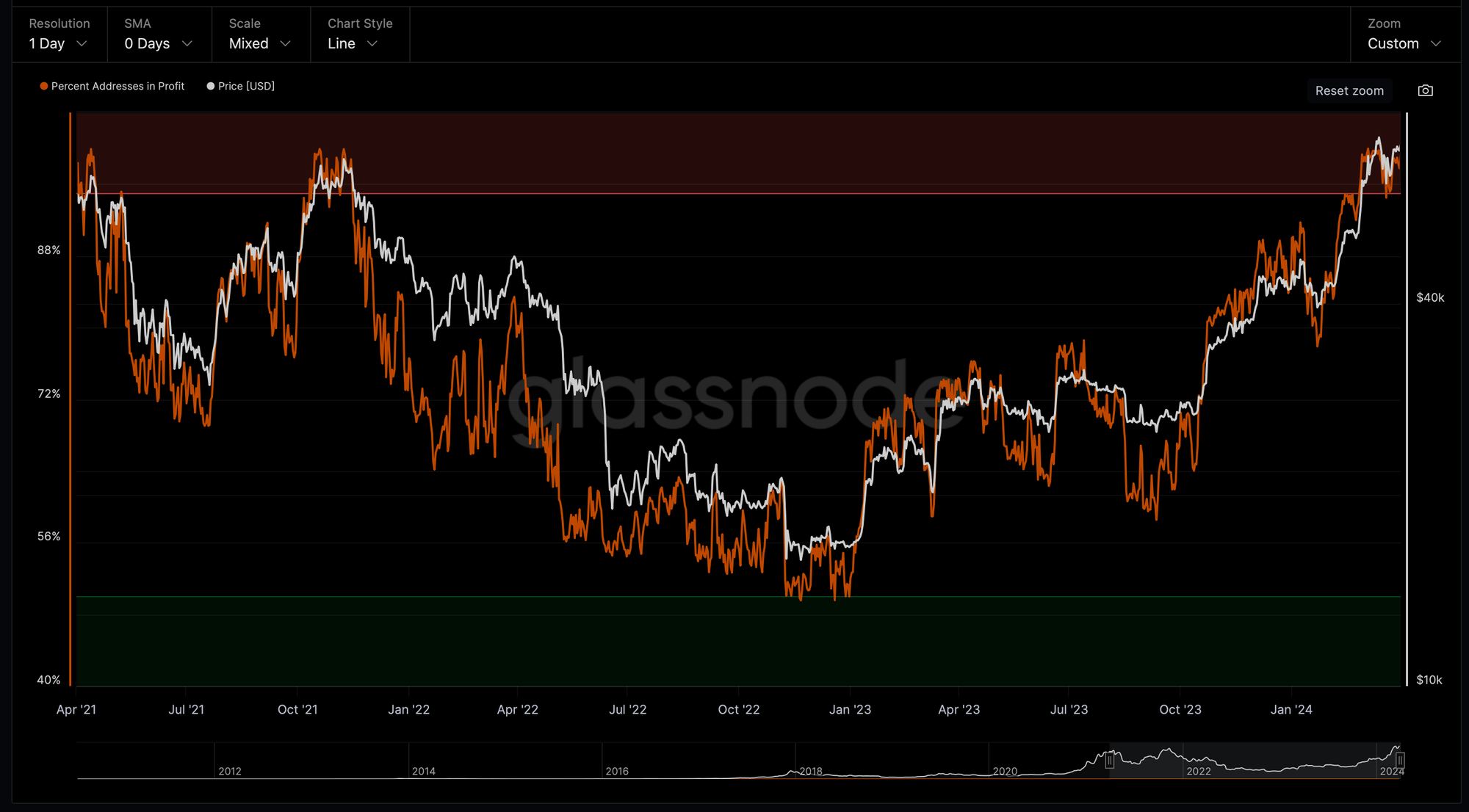
The percentage of unique addresses whose funds have an average Bitcoin buy price that is lower than the current price reached and remains around 98-99%.
This is the common value Percent of Addresses in Profit during the bull runs and we saw this metric lingering above 90% during the previous bull markets in 2016-2017 and 2020-2021.
With the March correction, we saw this indicator diving to below 95% followed by a quick recovery of the metrics and Bitcoin price.
Net Realized Profit/Loss
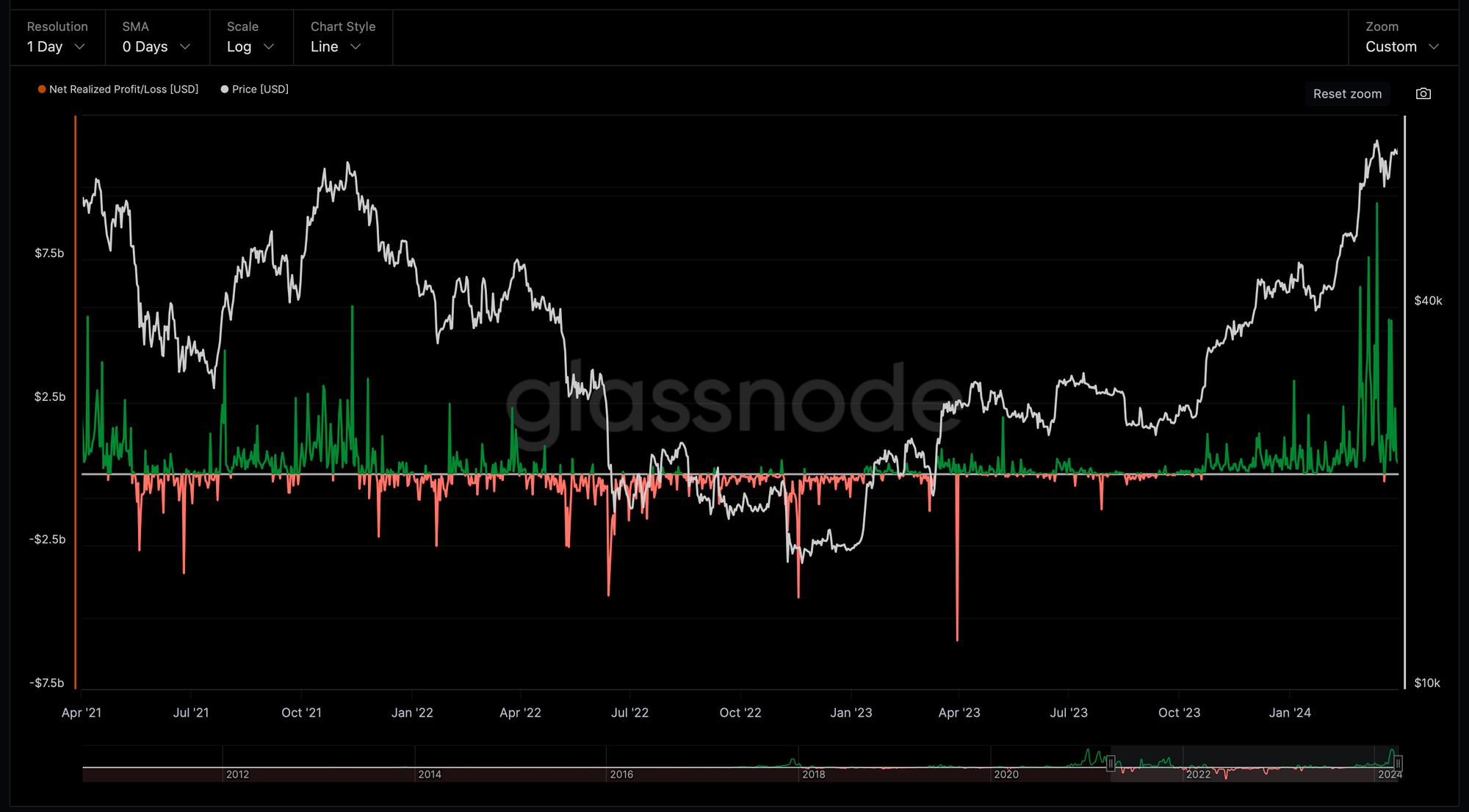
Net Realized Profit/Loss Ratio is the net profit or loss of all moved coins, and is defined by the difference of Realized Profit - Realized Loss.
At ATH in March, Bitcoin reached a highest Realized Profit/Loss Ratio at 9.5 billion USD.
Realized Profit / Loss Ratio Momentum
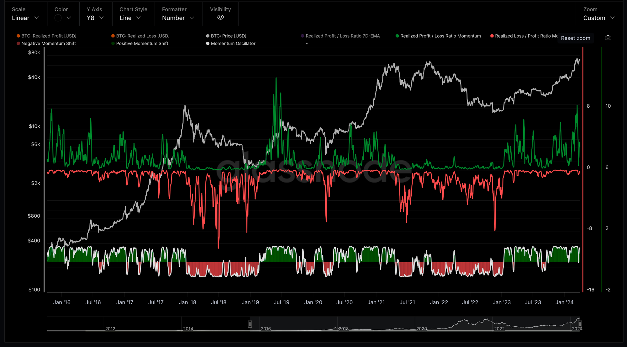
And at the same time, with the bullish rally in Q1 2024, we saw a period where the Profit/Loss Ratio was experiencing acceleration with positive momentum reaching the levels of the previous bull cycle of 2020-2021.
Adjusted SOPR
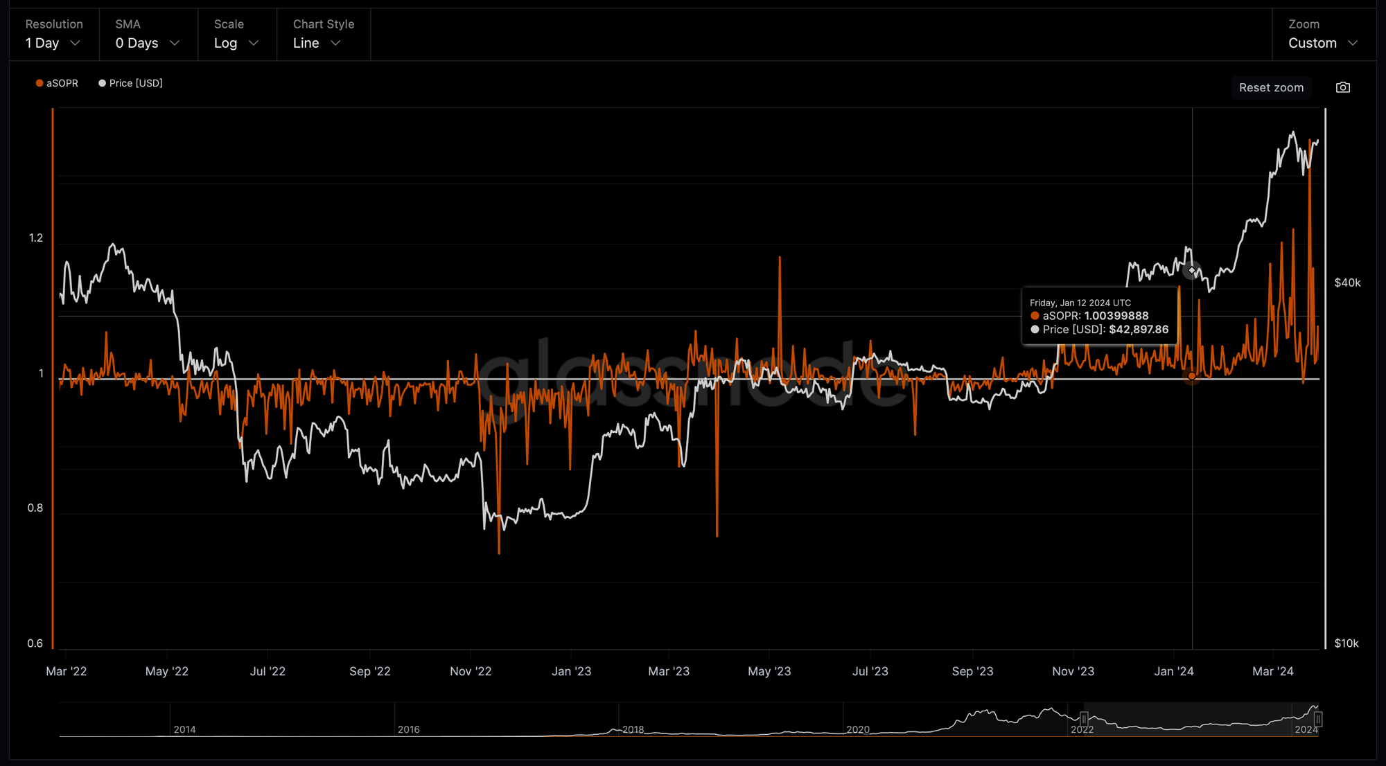
The Spent Output Profit Ratio (SOPR) indicator provides insight into macro market sentiment, profitability and losses taken over a particular time-frame.
It reflects the degree of realised profit for all coins moved on-chain.
SOPR is measured by considering only coins moved the timescale considered and taking the ratio between the price paid versus the price sold for the coins.
Adjusted SOPR is SOPR ignoring all outputs with a lifespan of less than 1 hour.
During the bull rally in Q1 2024, we saw consistent SOPR value peaks greater than 1 implying that the coins moved in those peak days, on average, selling at a profit (price sold is greater than the price paid).
We also saw SOPR trending higher implying profits are being realised with potential for previously illiquid supply being returned to liquid circulation.
Coin Days Destroyed
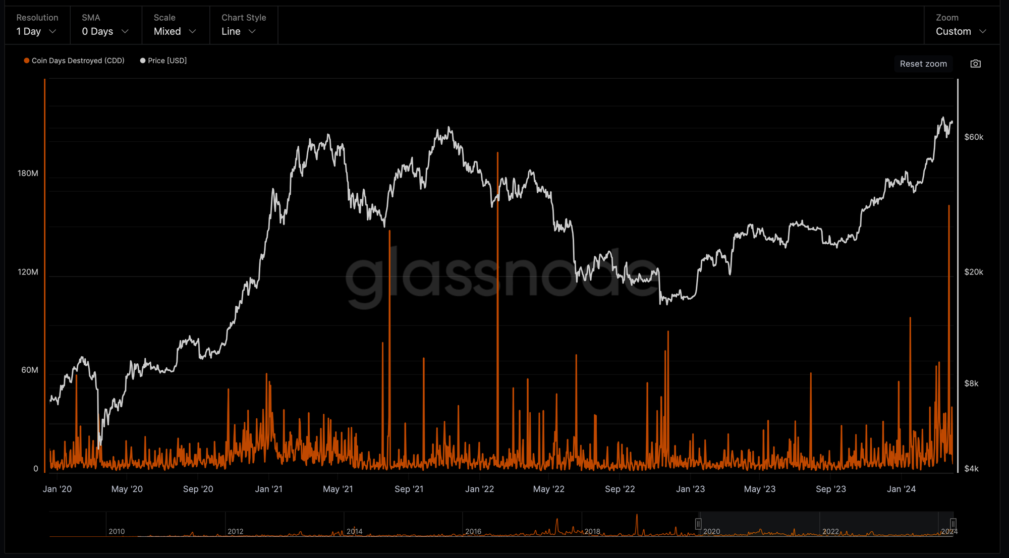
And this is what we also observing in Coin Days Destroyed (CDD) metric.
The above indicator offers insights into market participants who have held Bitcoin on-chain for an extended period.
CDD metric is a measure of the cumulative number of days that Bitcoin has not been moved before it is spent or transferred.
A spike in a number of Bitcoin Days Destroyed last week to a value of 163 million when Bitcoin was trading around $64,000 indicates a large distribution of old coins by long term holders (smart money) and could signal an approaching top of the bull cycle.
Bitcoin Distribution Cycle
HODLers Net Position Change
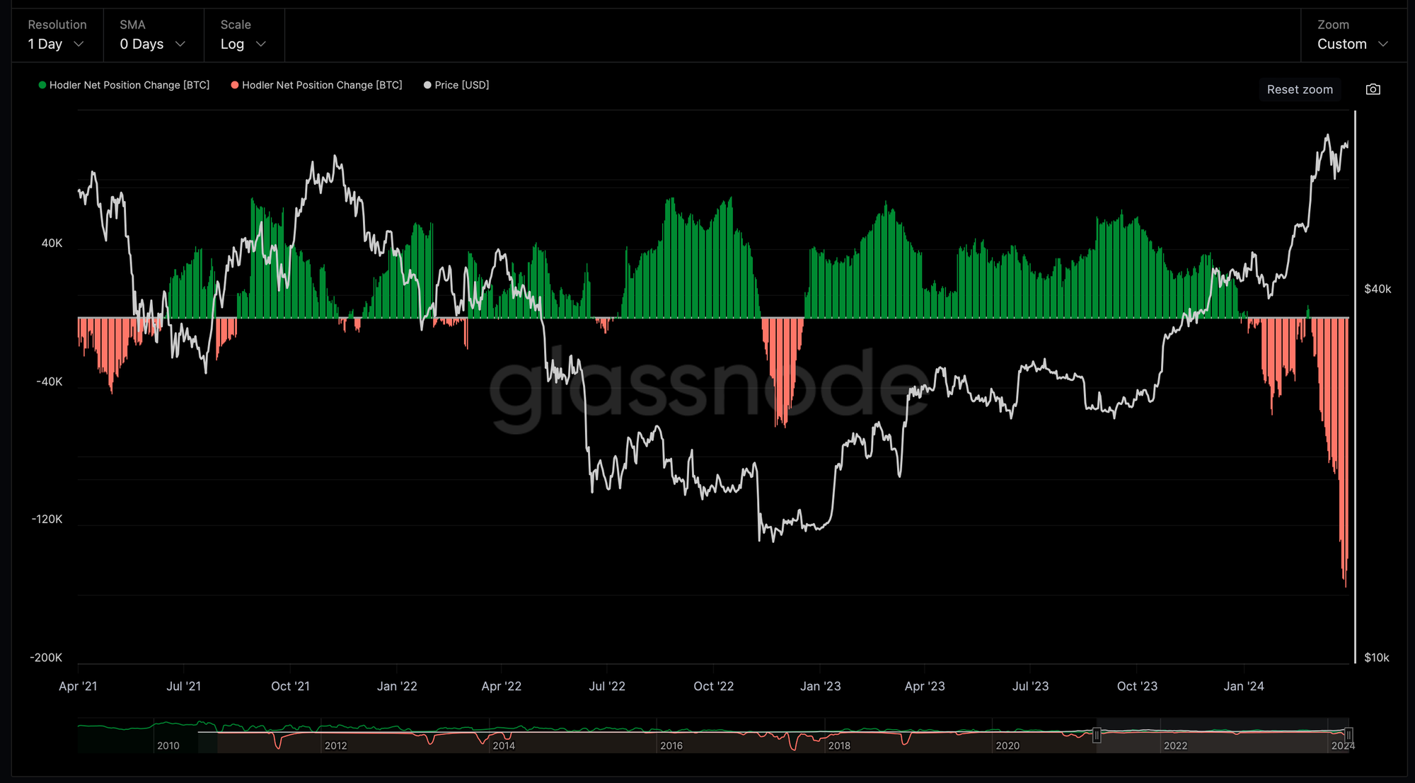
During pre-ETF approval consolidation in January, we also saw a change in the net position of long term investors (HODLers).
HODLers started cashing out (pink histogram) and we saw a continuation of the distribution from ~$45,000 to the new ATH.
Long-Term and Short-Term Holder Supply
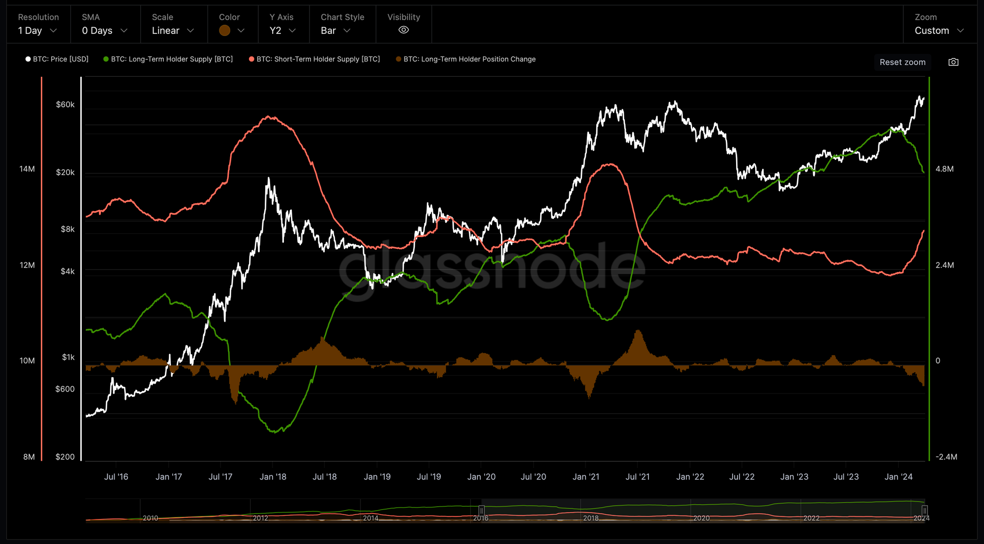
Similarly with the previous bull cycle in 2020-2021, the distribution phase by long term-holders started, when Bitcoin was very close to the previous All Time High.
And, it continued during the parabolic move of Bitcoin throughout end of 2020, beginning 2021 and topped at the market pick of 2021.
The above chart shows the total amount of circulating bitcoin supply that is held by long-term holders (green line) and short-term holders (pink line), where long-term holders are defined as addresses that have held Bitcoin for 155 days or more.
In the current cycle, we also saw a beginning of the macro distribution phase by long-term holders starting in December when Bitcoin price was approaching ~$40,000.
For the current cycle, the long-term holder supply peak was 14.9 million BTC around ~$40,000.
This is where we saw a beginning of the distribution phase that is still going on reaching 14 million BTC.
To compare this with the distribution cycles that we saw in 2016-2018 and 2020-2021:
- on December 21, 2016, the long term holders started the distribution at the peak of 11.5 million BTC and finished on January 7, 2018 at 8.6 million with the total of 2.9 BTC distributed in 382 days
- on October 16, 2020, the long term holders started the distribution at 12.7 million BTC and finished on March 17, 2021 at 10.9 million with the total of 1.8 million BTC distributed in 152 days
The shortening of the time and a reduction of the amount of Bitcoins distributed by the long-term holders is something to keep in mind, especially given the supply shock after Bitcoin ETF approval.
The primary expectation is that we will see a continuation of a bull market that most likely will continue.
However, it will last less than 152 days and less than 1.8 million BTC will be distributed by the long-term holders at the peak of the current market.
By March 31, we saw a distribution of total 0.9 million BTC by long-term investors and it took 119 days.
Bitcoin Addresses
The number of unique entities (Whale Cohort) holding at least 1k of Bitcoins (orange line) was growing exponentially since approval of Bitcoin ETF in mid January.
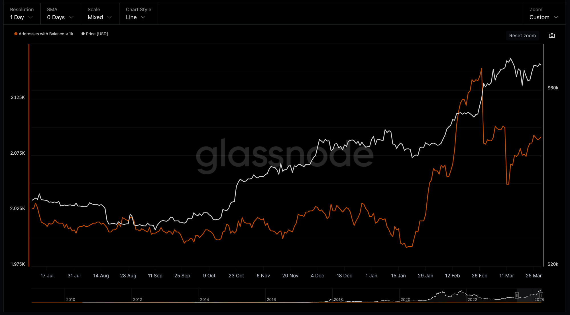
Since Bitcoin reached ~$57,000 we saw a decline in a number of addresses which fall into the Whale Cohort (>1k BTC), defined by BTC coin balance (orange line).
This could indirectly confirm the beginning of the distribution phase by Whales.
However, we saw a "V-shape" recovery in the number of large addresses once Bitcoin went into correction from the new ATH at ~$73,000.
And, a number of addresses with balance more than 1,000 BTC continues to grow.
This is a strong bullish signal indicating that a continuation of the uptrend is very likely.
Bitcoin Derivatives
Total Futures Liquidations
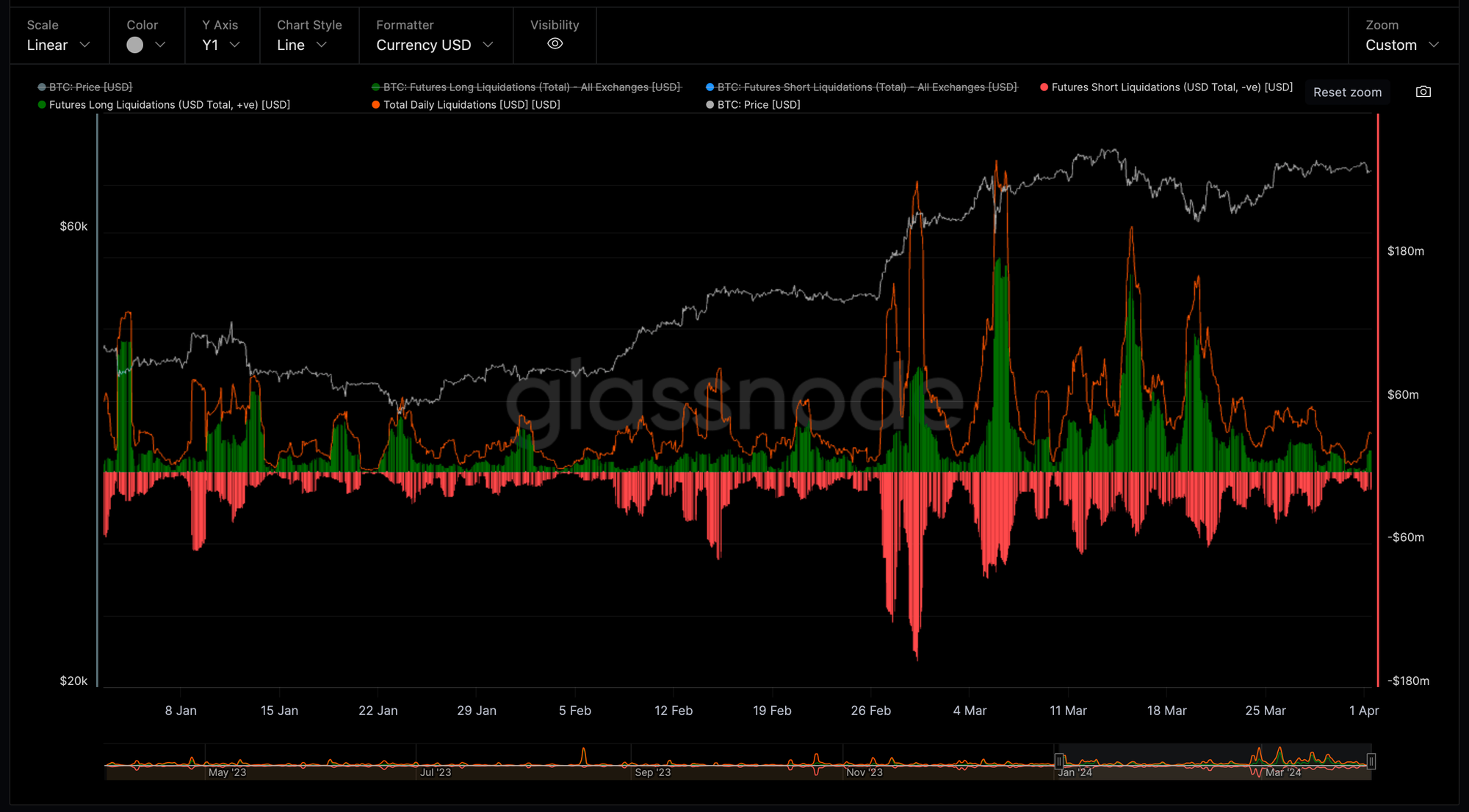
After significant last liquidation events on March 15 and 20, the futures market is cooling off dropping to lowest values to beginning of March.
Annualized Perpetual Funding Rates vs 3m Rolling Basis
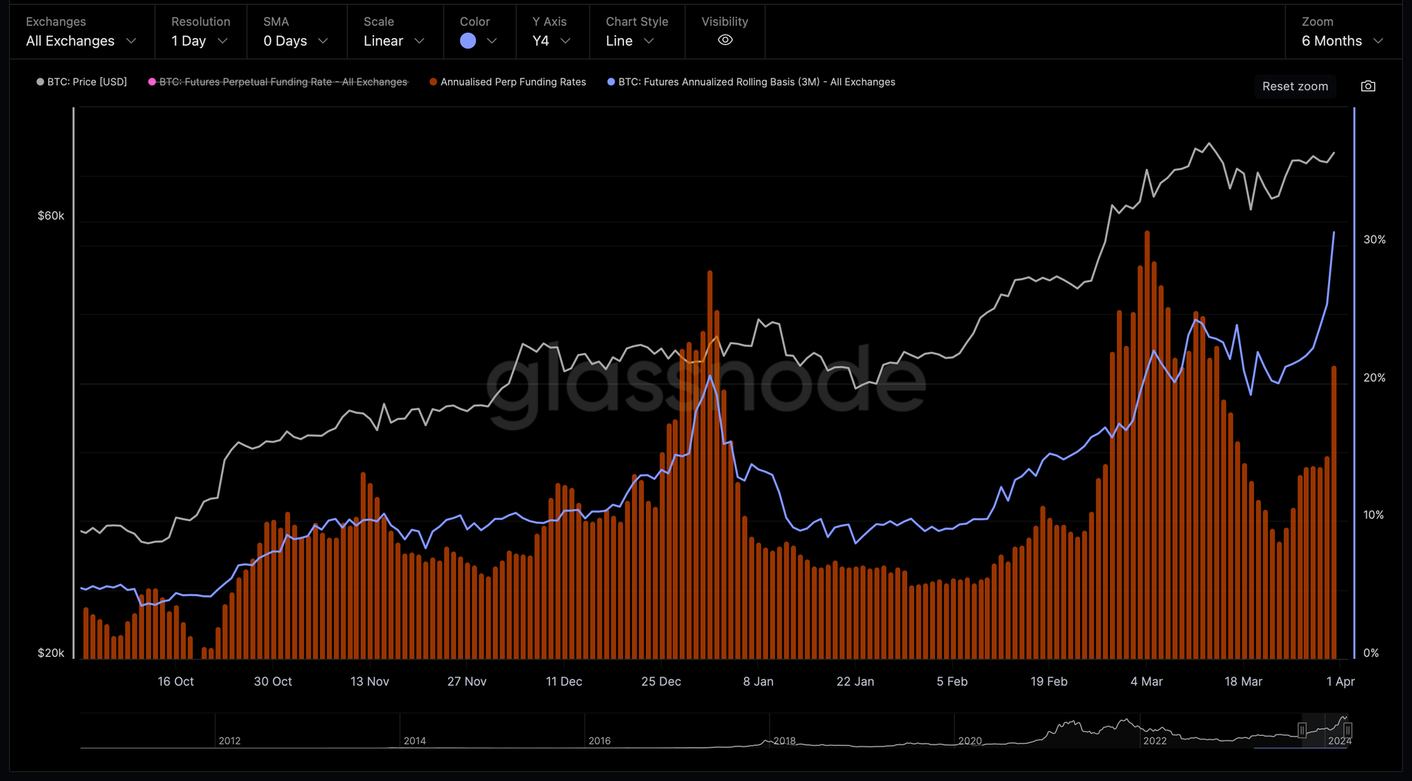
This metric compares the annualized rates of return available in a cash-and-carry trade between 3-month expiring futures (blue), and annualized perpetual funding rates (orange).
Periods where perpetual basis trades lower than 3-month expiring futures basis have historically occurred after a downside price action and de-risking, such as during bull market corrections.
And, this is what we are observing at the moment.
Futures Perpetual Funding Rate
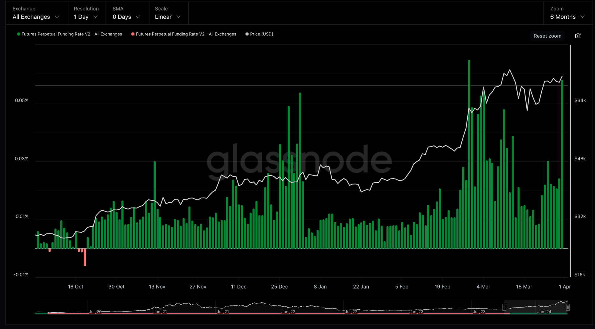
Bitcoin Futures Funding Rates continue was slightly elevated lingering around 0.022% last week, however yesterday it moved up to an average of 0.058% signalling a strong confidence in the market about further upside potential.
However, the present Funding Rates are still significantly below of the values we saw in the previous bull cycle.
Conclusions
The Bitcoin price has rallied to a new ATH in March above $73,000.
It led to an uptick in profit taking by the Long-Term Holder cohort and a continuation of the distribution phase.
On the other hand, the overall market liquidity, buying power, net flow volume of Bitcoins, as well as a growing number of addresses with more than 1,000 BTC and the state of the Bitcoin futures market suggest that more upside in Bitcoin price is very likely short- to mid-term.